Brand Design
These are some design works I made for different brands within different industries. I tried to dig out each brand's inner characteristics and incorporated them into my own design.
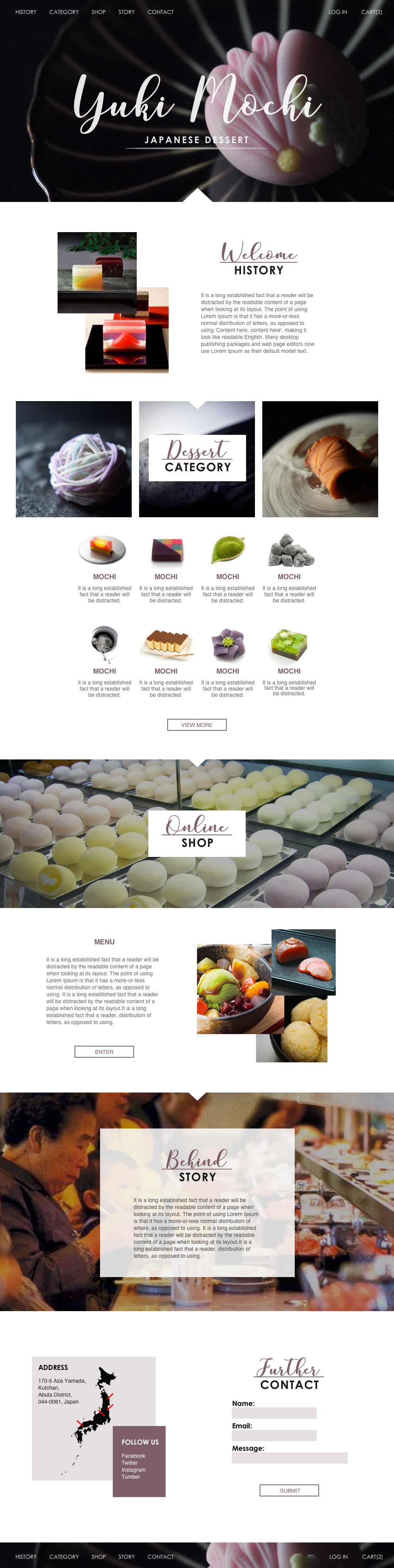
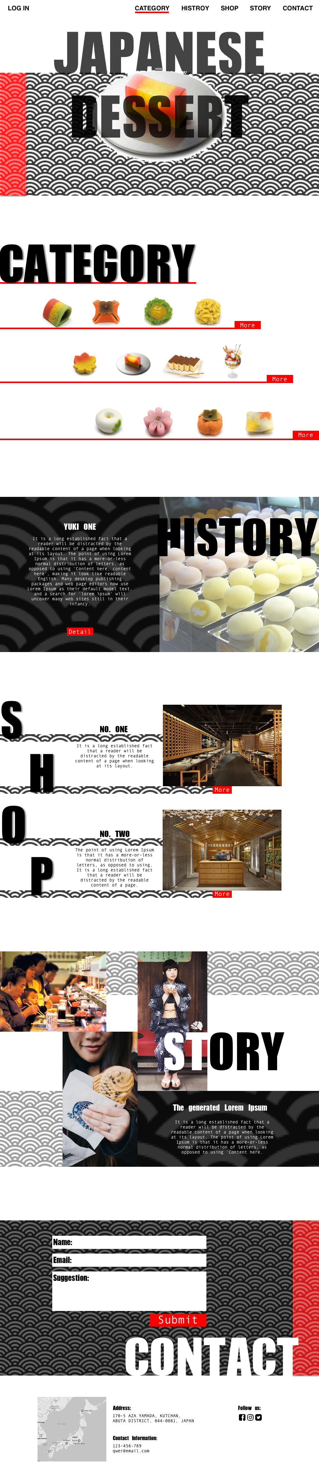
Website Design for Japanese Dessert
Left:
Modern style. I used grid to organize the whole website and positioned some overlapping pictures to break overall geometric shapes. Strong contrast between two very different typographies helps attract viewer's attention.
Right:
Post-modern style. Fish pattern texture acts as one overarching element. It appears in different sections as various forms indicating the underlying Japanese culture. Besides, I played around with pictures using some post-modern tricks like collages to create a more dynamic feeling.
Mblem Digital Badges for Umich
Mblem Badges are defined into eight categories. Each badge represents student's experience or expertise in that area. In my case, I redesigned four categories and interpreted them in two different ways. One is using lines while the other is using planes. The former's color pallet is exact the same as it is right now and the latter's is more diverse and ambiguous.
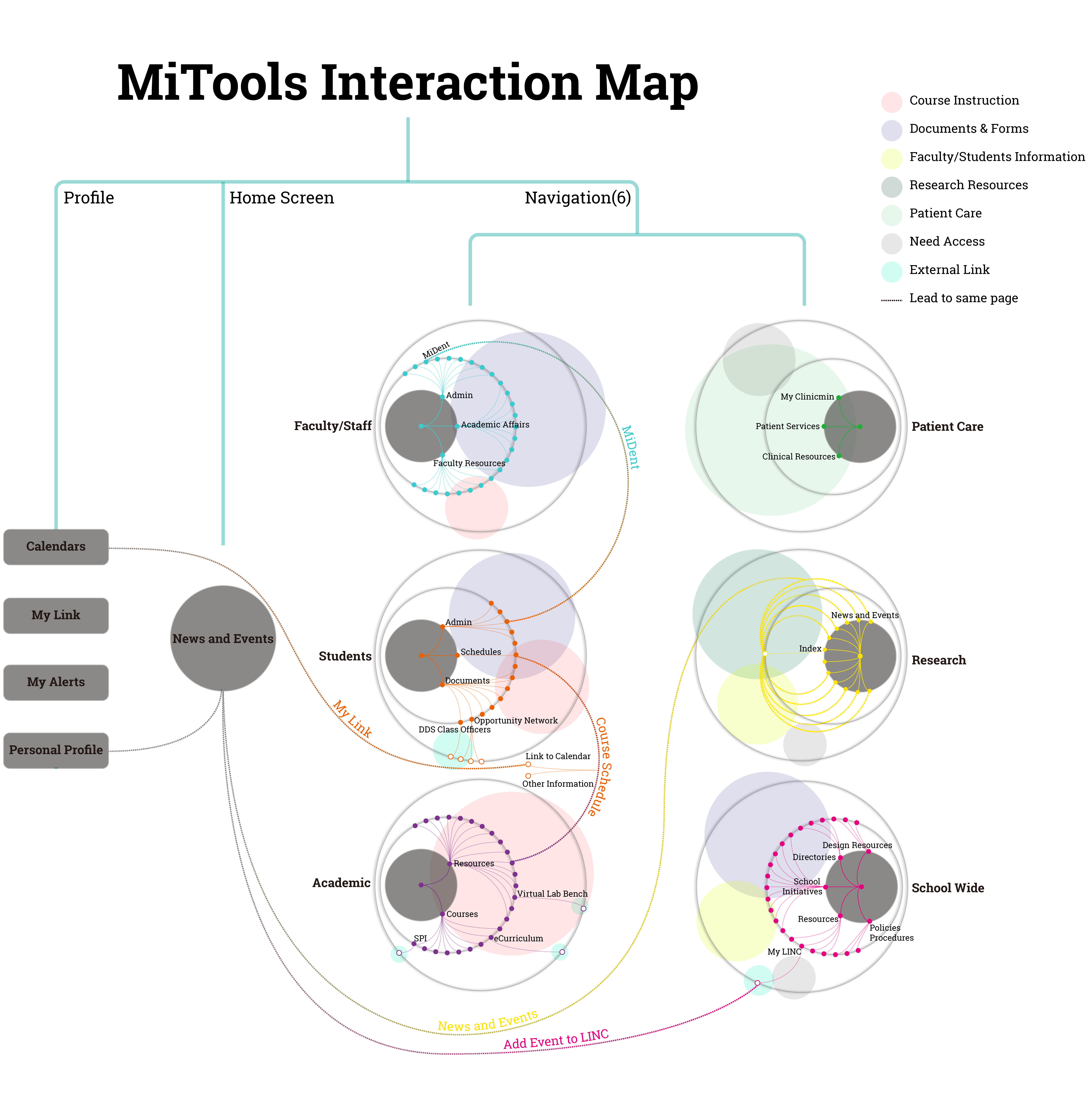
Interaction Map for MiTools
MiTools is UM dental school's intranet. It contains lots of information and holds many interactions between users and the website. It also embeds other commonly used tools such as google calendar, aiming at providing one-stop service.
My mission here is to create an interaction map for our research team to better understand its structure and main functions.
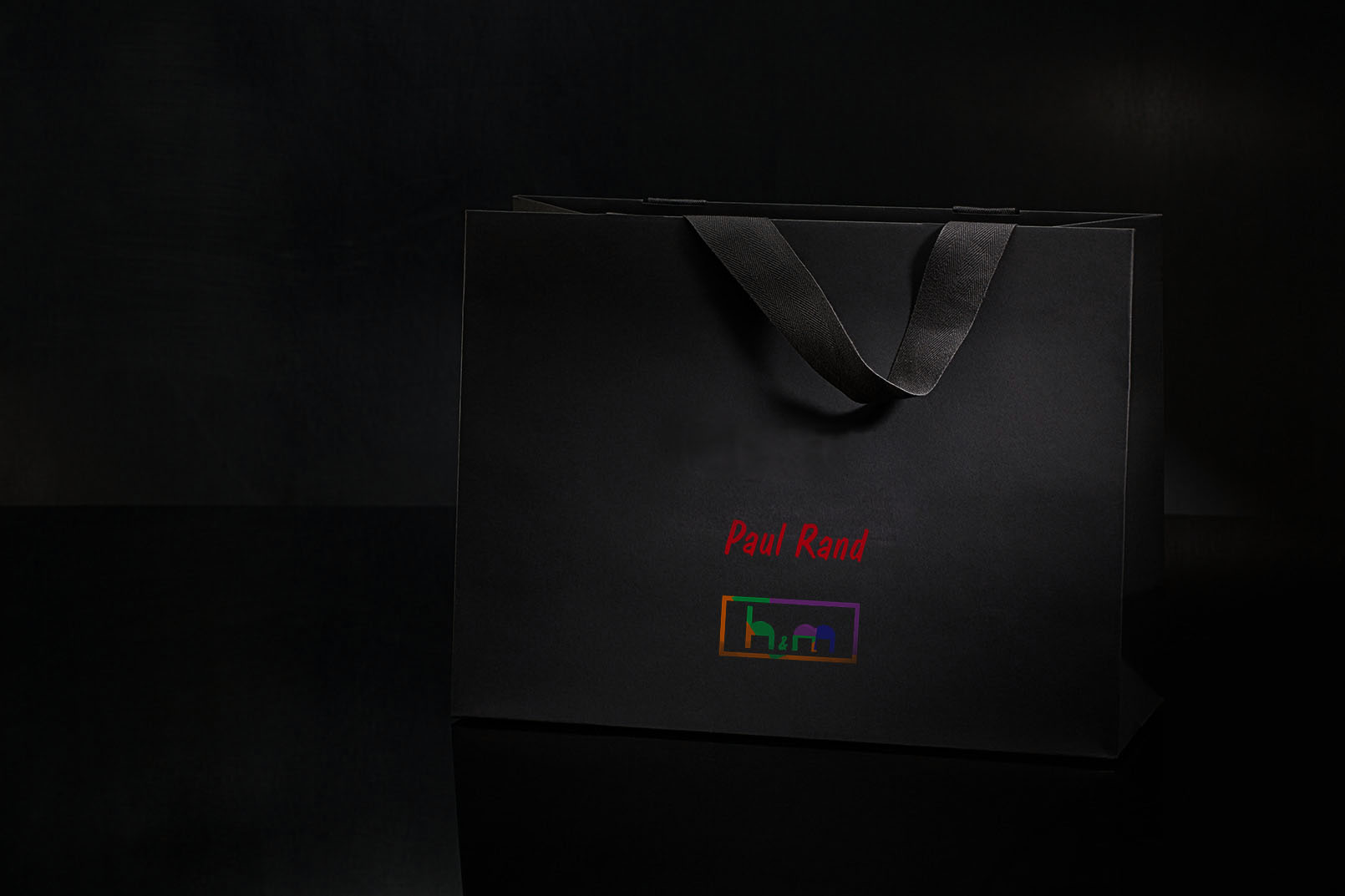
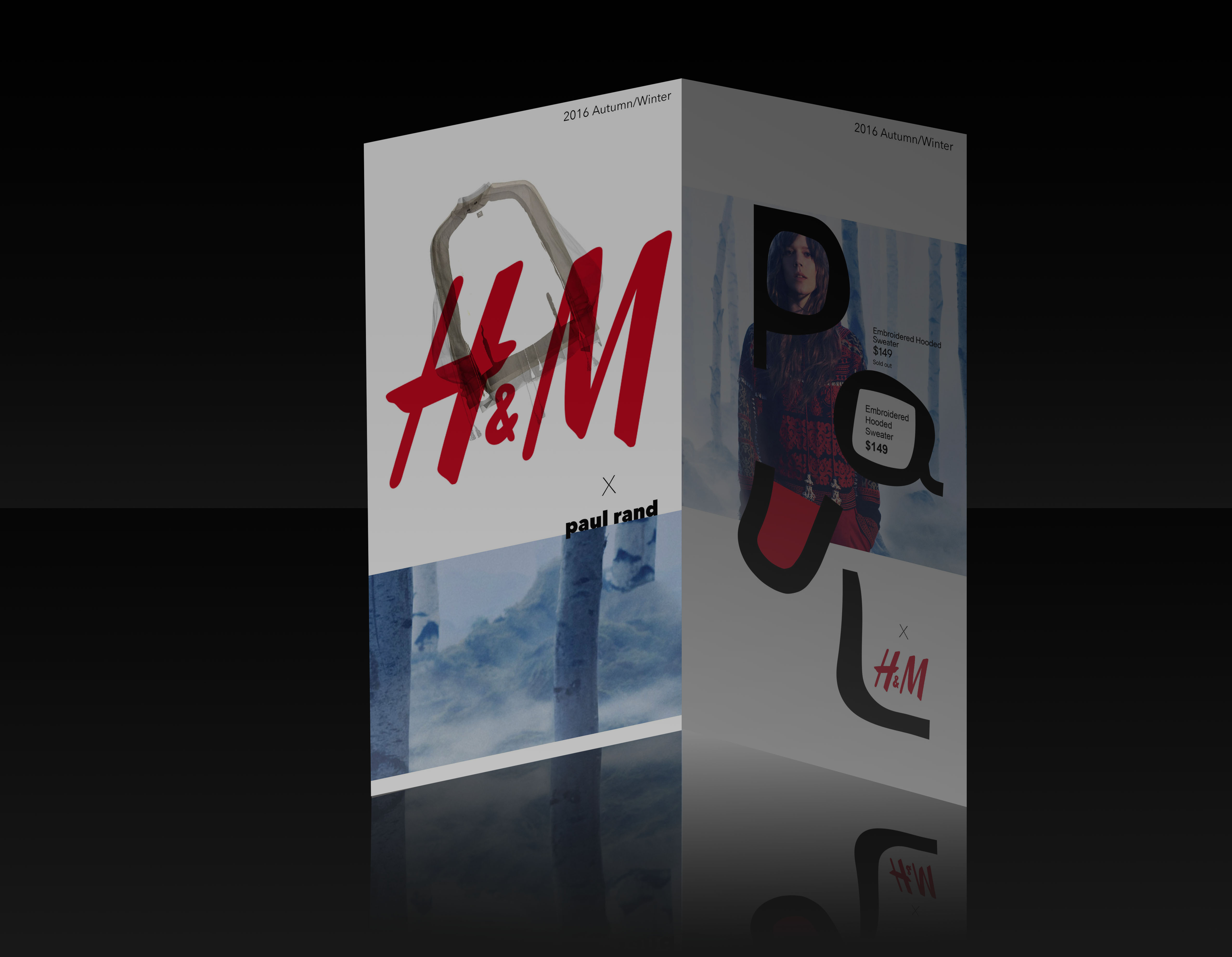
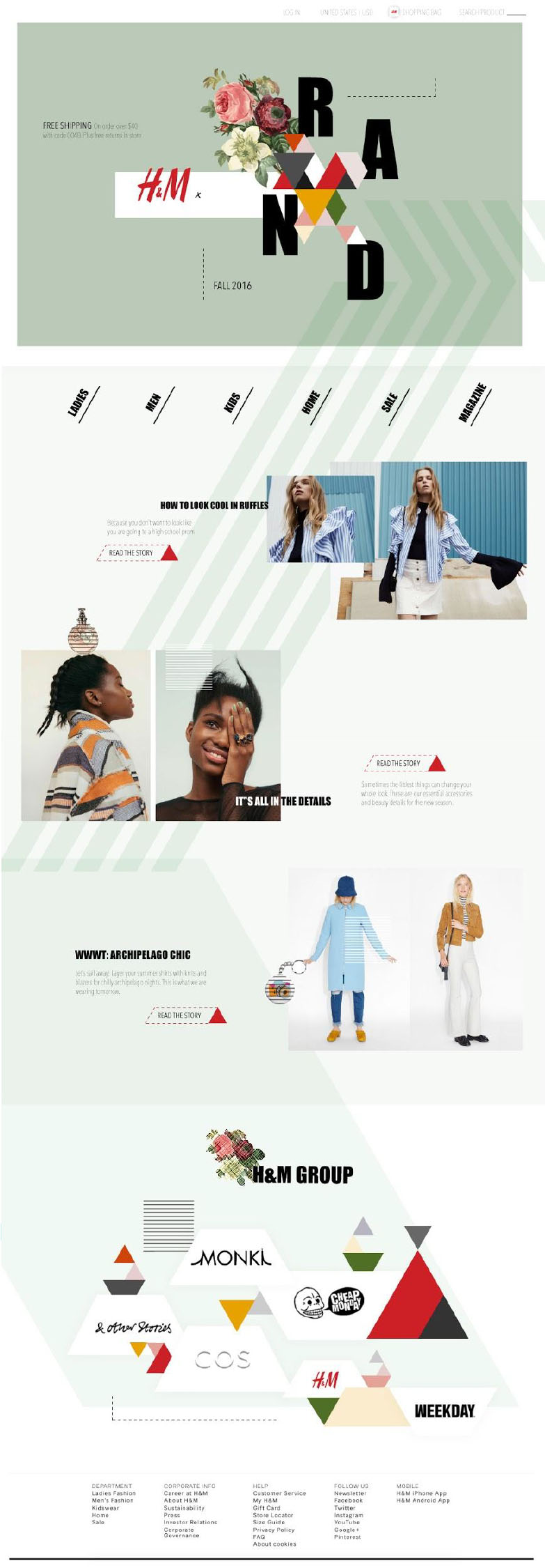
Brand Design for H&M + Paul Rand
Paul Rand is a famous artist in 20th century who designed the well-known IBM logos. We explored his design philosophy which we think was "Defamiliarize the ordinary", and tried to apply it to other brands like H&M. His courage of using many conflict colors also inspired us and helped lead us to our final design.
Full Study