
Ceremony
The goal of the mobile app is to empower employees to rate the success of reoccurring meetings (ceremonies) at work. The app then provides data on organization's meetings that will help them improve their productivity.
- Project Brief
- 2016.10 ~ 2016.12
- Group Project (team of 5)
- Client: Tom Meloche
- My Role
- UX/UI Designer
- UX Researcher
- Method & Skills
- Competitive analysis
- Sketch
- Persona & Storyboard
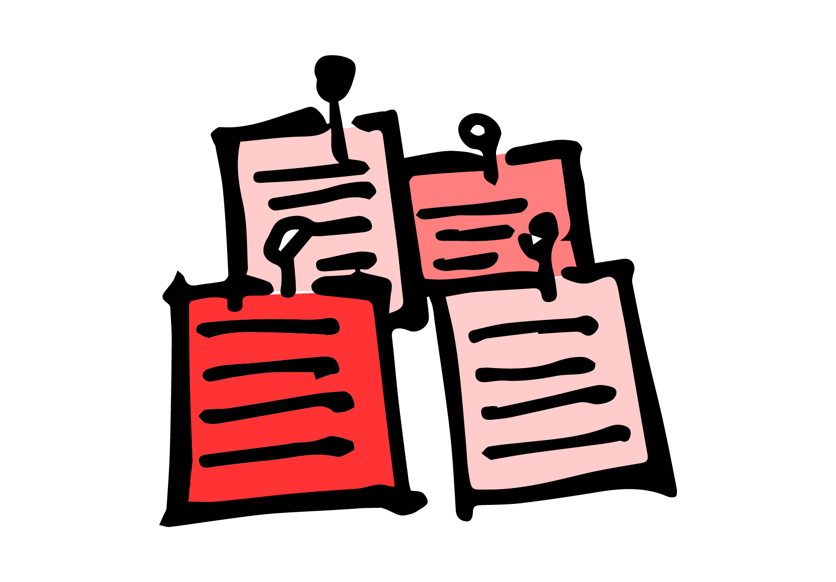
- Contextual Inquiry & Interview
- Wireframing
- Prototyping
- Iteration
- Tools & Softwares
- Sketch
- Framer.js
- Invision
- Balsamiq
Problems
Meetings don't evolve fast
Employees are not empowered to give feedback
How to visualize feedback in a clear way
- Ceremony
-Our client Tome Meloche wrote the book Ceremony which he says will improve productivity for everyone.
-Ceremony is any repeated social interaction between two or more people, like meeting, wedding, friend gathering etc.
-He wants to launch a companion app for people to report back feelings after ceremonies.
-The potential customers will be tech companies which adopts agile development, so we mainly focused on meetings.
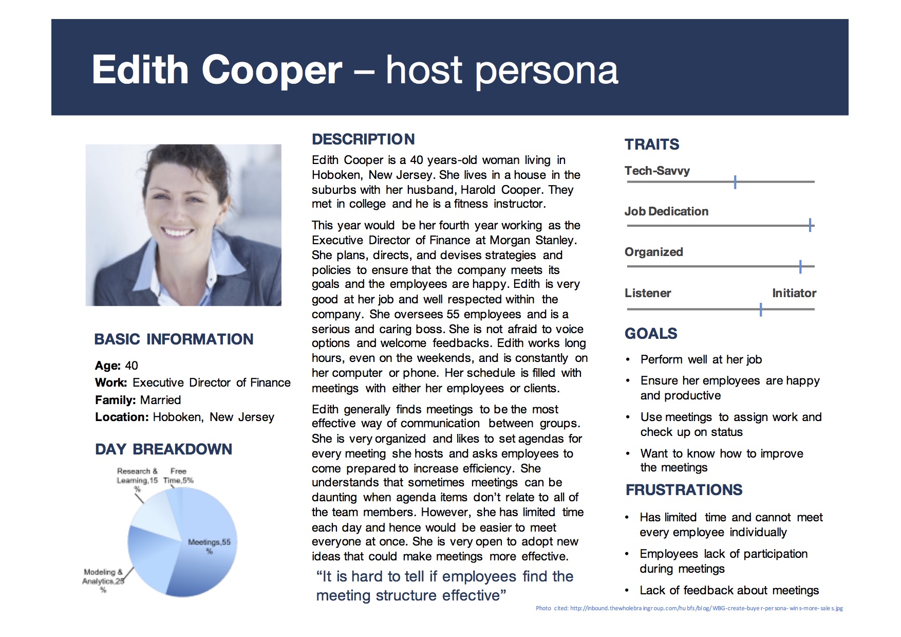
User Research

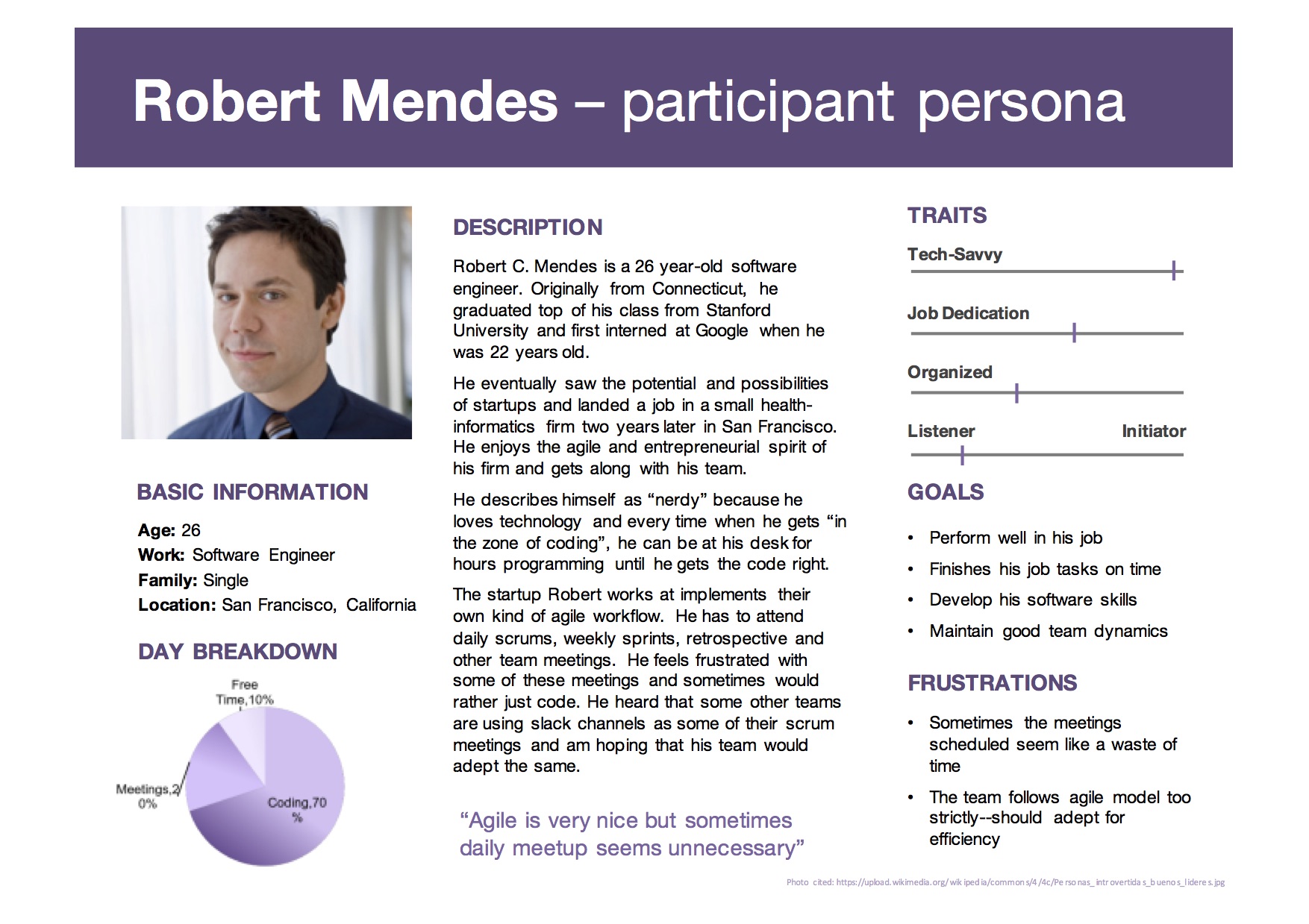
Persona
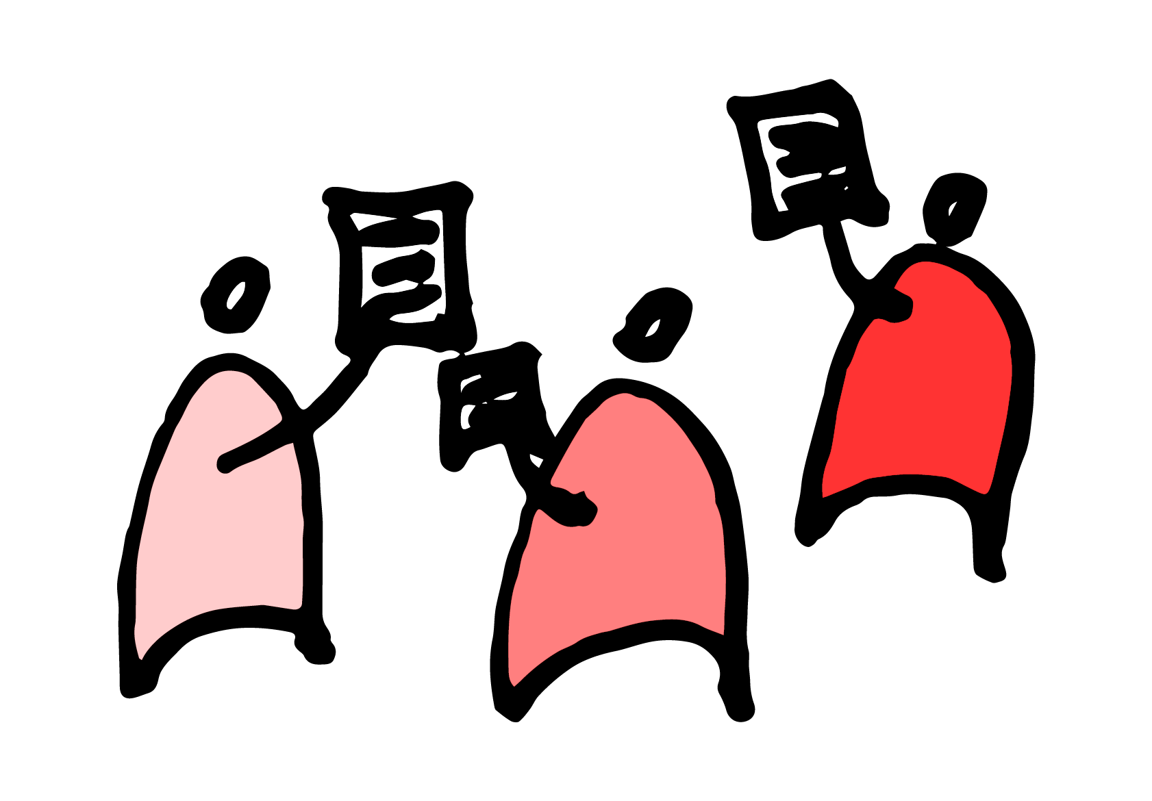
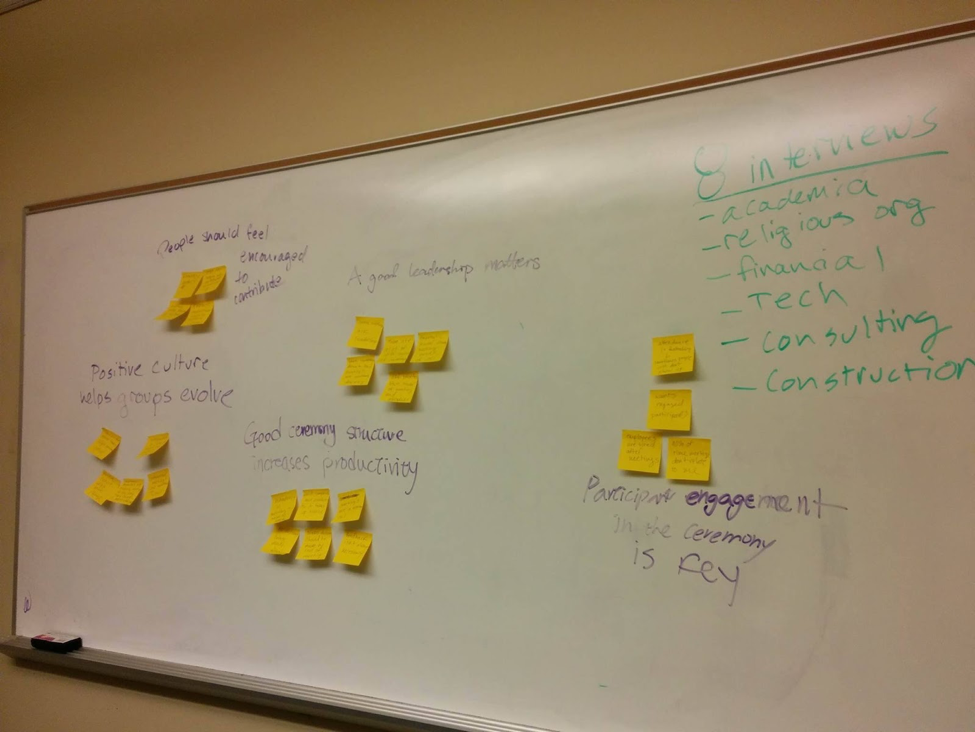
To better understand users, we first did our own user research. We interviewed 8 different people and asked them questions about the meetings they attend. We talked to people who work in a wide range of industries including academic, religious, financial, construction, co-op housing, consulting, and technology.
Based on the that, we created persona of a meeting's participant and host to better understand how each ceremony goes and what people's emotional status is after reoccurring meetings.
"Agile is very nice, but sometimes daily meetup seems unnecessary."
"It is hard to tell if employees find the meeting structure effective."
Key Findings
So, what makes a good meeting?
We created an affinity wall based on the interviews. Here's attributes we found apply to a productive meeting.
- Participant engagement in the meeting is key
- People should feel encouraged to contribute
- Good leadership matters
- Good meeting structure increases productivity
- Positive group culture helps meetings evolve
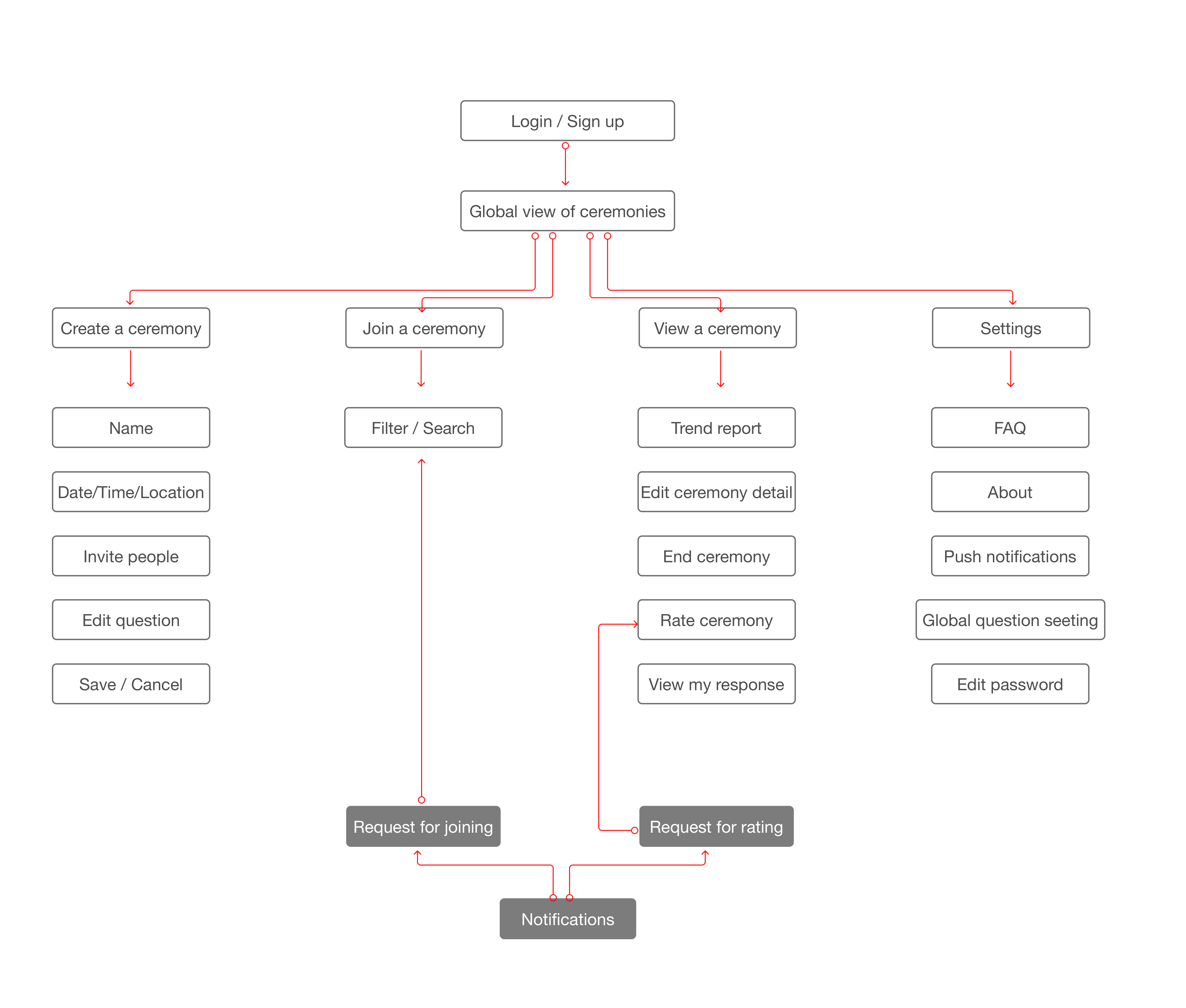
Sitemap
We incorporated needs of both personas into our sitemap. The findings will be used specifically as criteria for meeting evaluation.
From this sitemap, we found two parts extremely important: rating process and data visualization in dashboard, which will be touched on later on "Design Iteration".
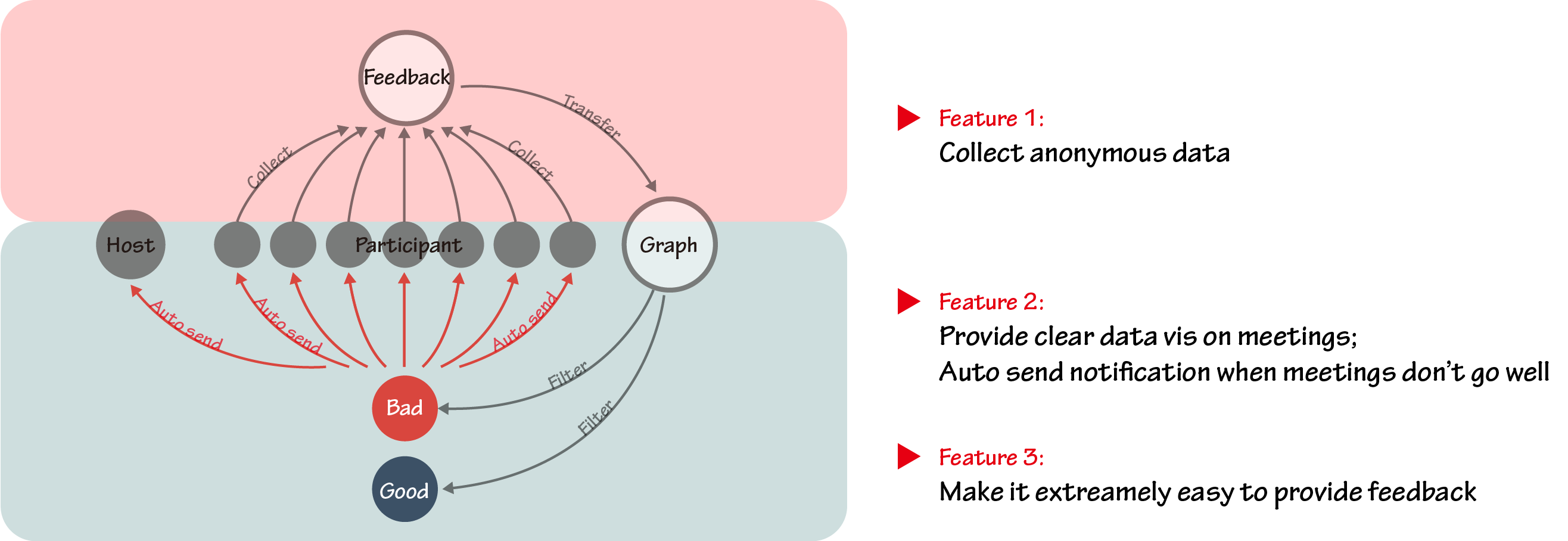
Solution Overview
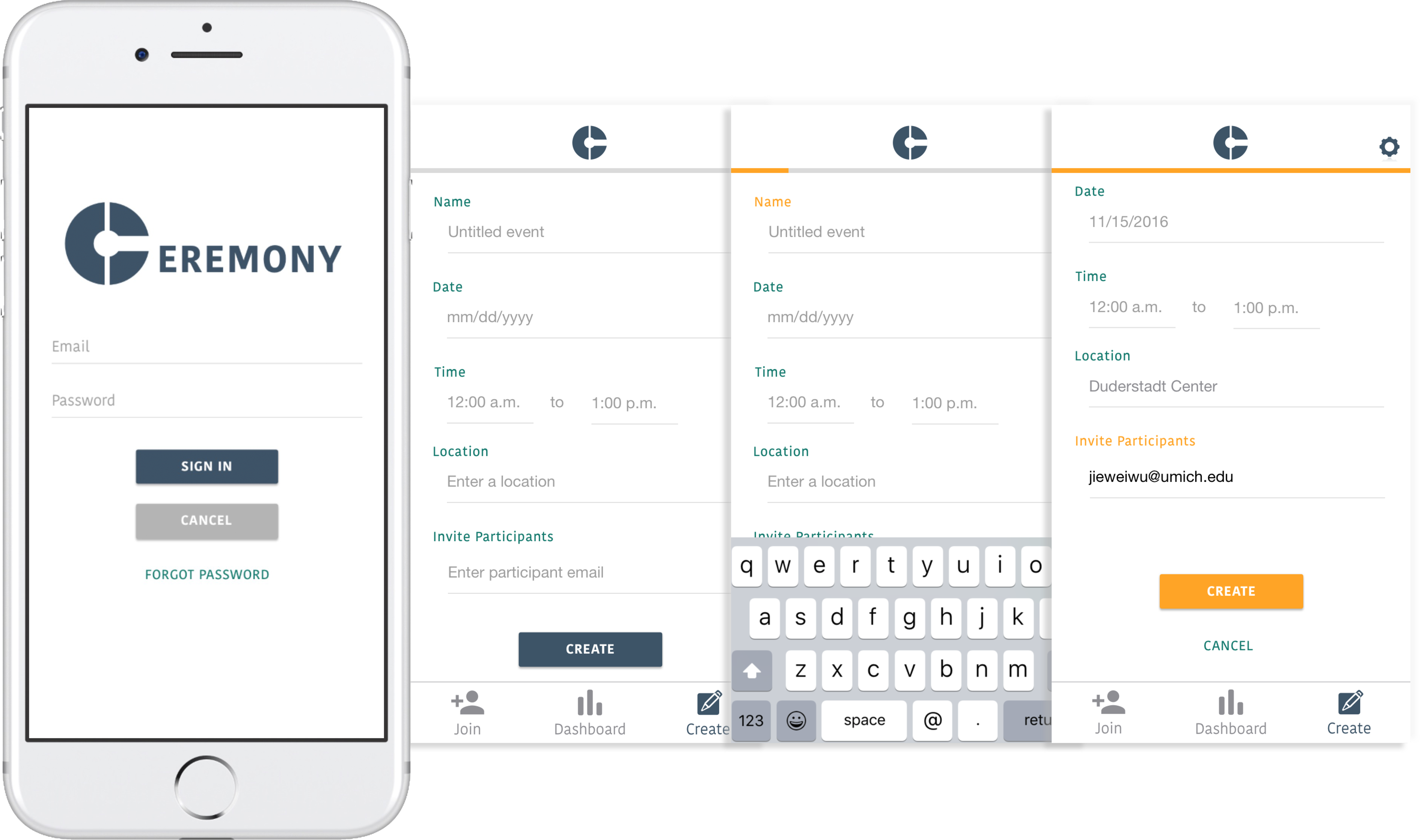
1) Set up a ceremony
We decided to make this process more seamless by including all of the fields on one screen and having a progress indicator at the top.
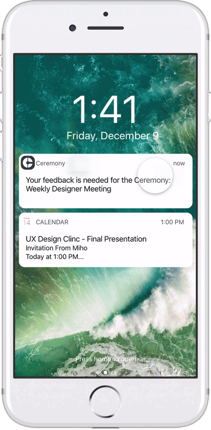
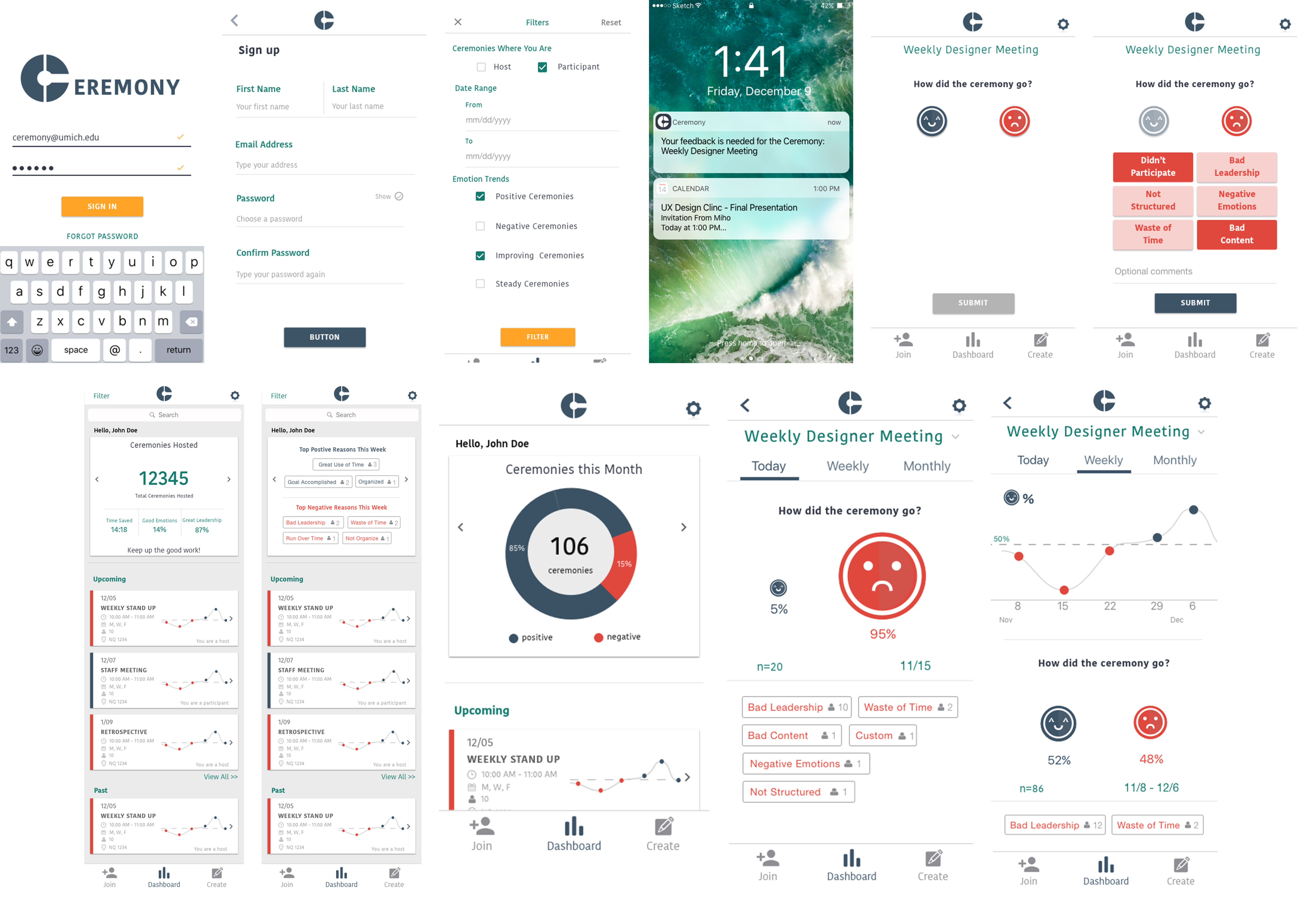
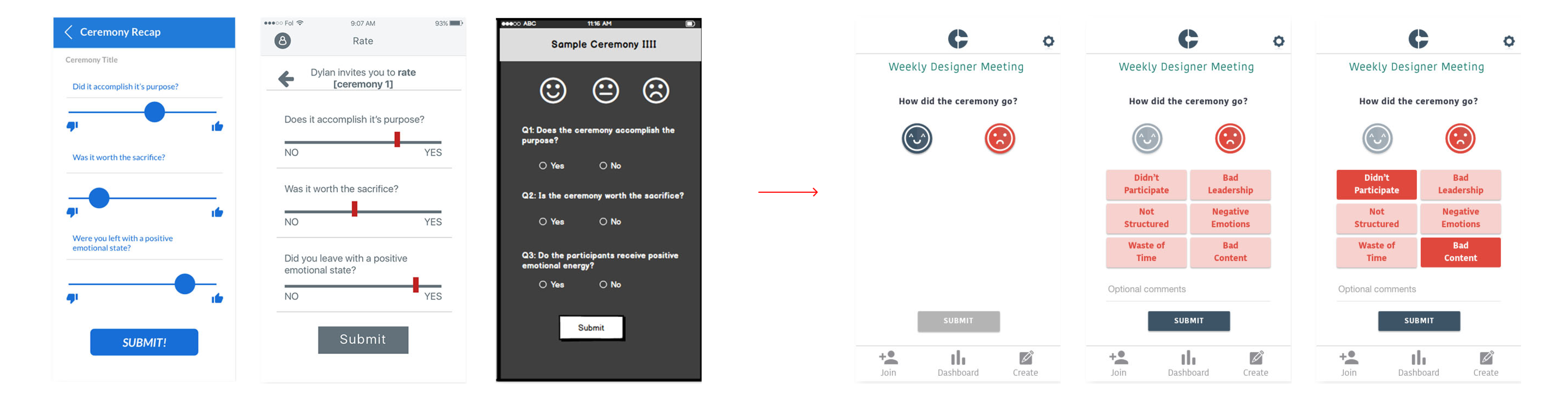
2) Receive notifications & Provide feedback
From our user tests we learned this was the most important part of the user flow. We had to make this as quick and as easy as possible or else users would not respond to the survey prompt. So we simplified the three questions our client outlined into one overarching "How did the ceremony go?".
A user just needs to tap a smiley button and they are done. However, to allow for more qualitative responses we added attribute buttons that are optional along with an optional comments field. The attributes can be customized. We used our affinity wall findings to create the stock buttons content.

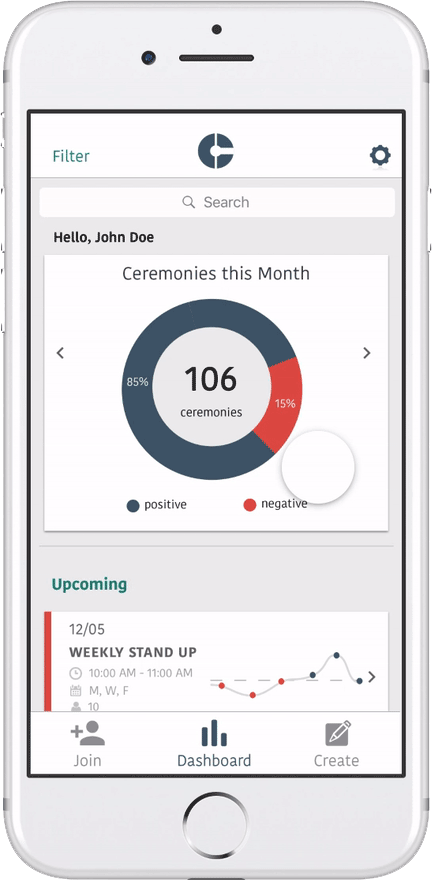
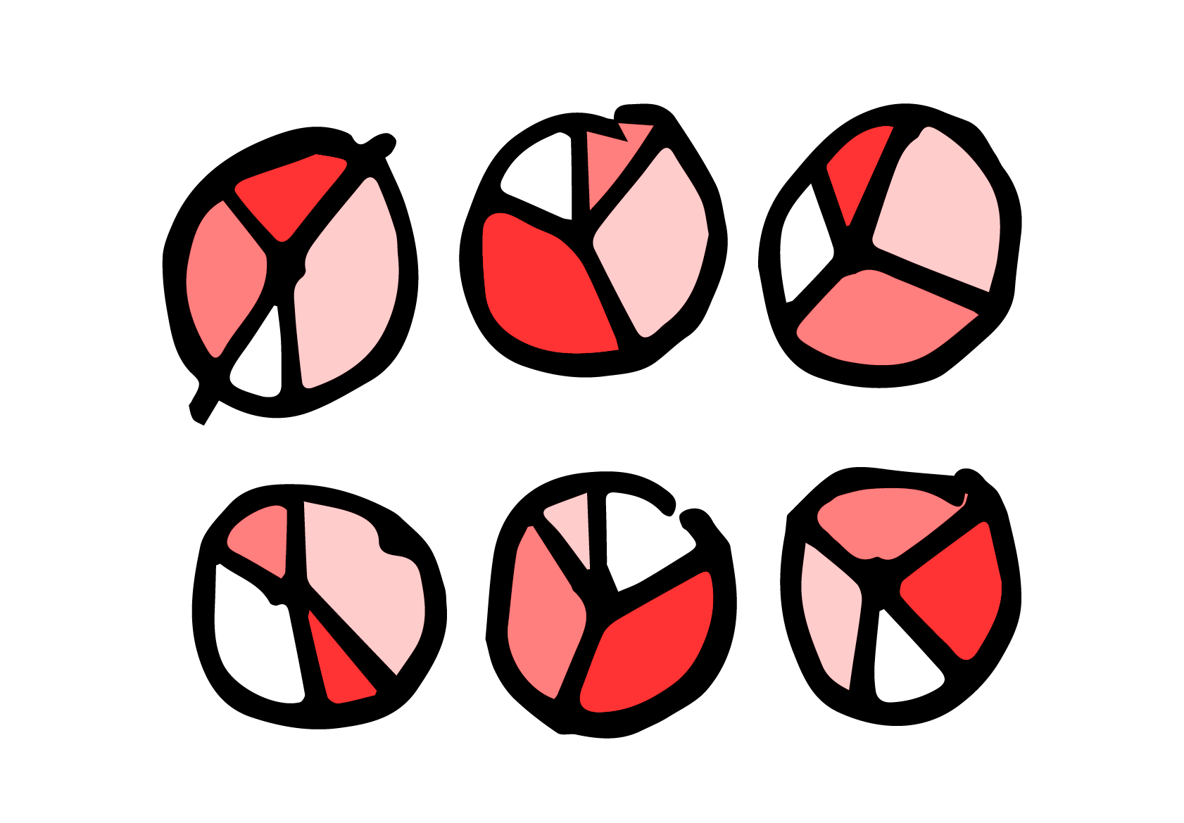
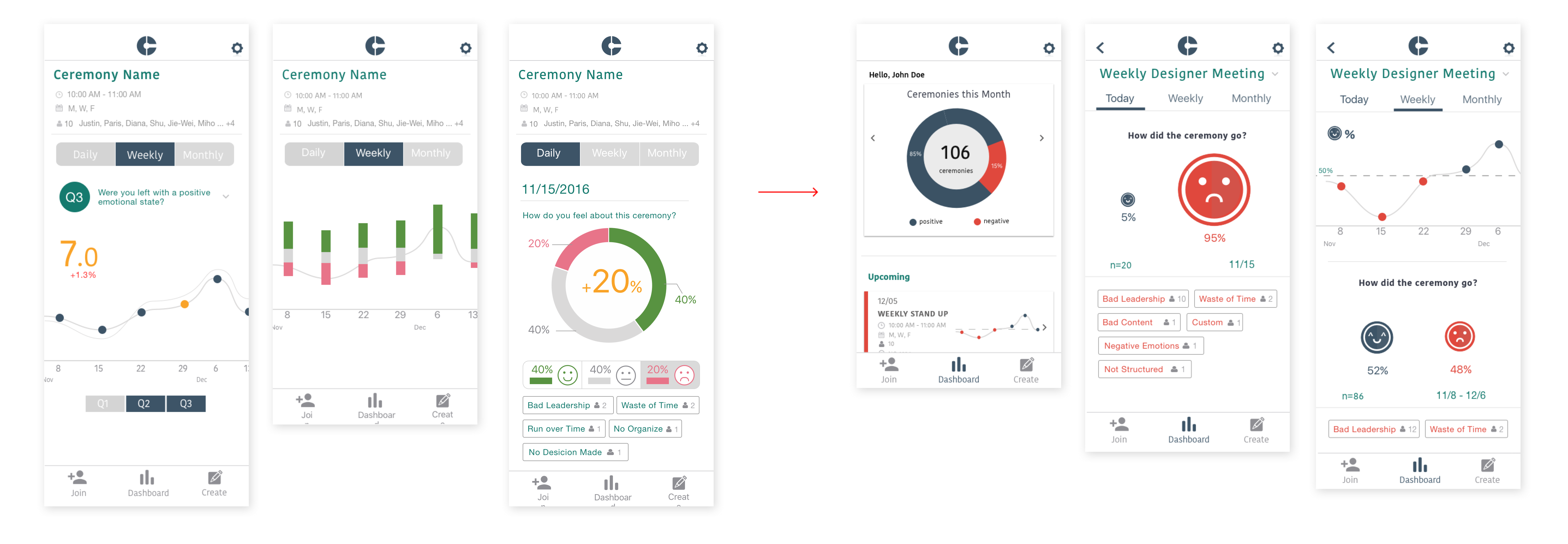
3) Analyze Data
Finally, we visualized the data from the survey responses in a dashboard. A user is provided an overview of all of the ceremonies they attend. Users can also filter the data to look for patterns and trends.
Users can also drill into the trend lines of individual ceremonies. The app puts data into the hands of employees.
Design Iteration
How to make rating quick while informative?
Our client Tom asked us to incorporate three questions he had concluded into the rating phase. We discussed a lot about it. Should we provide options like positive, neutral, negative, or should we provide a rating bar like "please rate from 0 to 5"? After testing, we found people can't tell the difference between a 3 points meeting and a 2 points meeting. Also in most cases they tended to be neutral because most meetings are just so so. However, the app is supposed to stimulate both participants and hosts to rethink their everday meetings. So we decided to make it extremely easy with only two options good meeting or bad meeting, we did it on purpose to push users to select an opinion.
How to make dashboard straightforward?
Too much information can be distracting, so we kept simplifying our design to make it easily understandable. In the end, we used different size for smiley and frowning face to indicate each ceremony's result.
Challenges
Communication with client in terms of his own vision
Solution: Use research and testing results to back up our design ideas
How to balance each person's idea in a team of 5 designers
Solution: Conduct design critique to iterate faster
How to make the abstract theory understandable
Solution: Use persona and scenario to help understanding